
يمكن لباليت تحديد الوجه الكريمي أن يمنح البشرة بُعدًا جذابًا، لكن البشرة الدهنية والمختلطة تُظهر عيوبها بسرعة. قد يصبح اللون باهتًا، وتختفي الحواف في لمعانٍ زائد، وقد يؤثر الملمس الغني على لون كريم الأساس. تكمن المشكلة في تصميم باليت لا في جعله شديد الكثافة، بل في جعل وضعه ودمجه وثباته أمرًا سهلًا وواضحًا للمستخدمة.
ابدأ بالظل، وليس قصة البرونزر
يؤدي كل من الكونتور والبرونزر وظائف بصرية مختلفة. يُرسم الكونتور عادةً وفقًا لمنطق الظلال المحايدة أو الباردة، بينما يُضفي البرونزر لمسة دافئة. قد يؤدي استخدام لوحة ألوان تجمع بين هذين الدورين دون توضيحهما إلى الإفراط في استخدامهما، مما ينتج عنه تشويش الكونتور الذي يلاحظه تجار التجزئة في عمليات الإرجاع والتقييمات.
العبارة تحديد الوجه مقابل البرونزر يساعد ذلك فريق المنتج على إبقاء شرح تشكيلة الألوان واضحاً. يمكن أن تدعم لوحة الألوان إطلالات إبداعية، ولكن يجب أن يظل هدفها الرئيسي واضحاً ومفهوماً عند النظر إليها من المرآة.
يجب أن يحافظ نظام التحكم في الزيت على الانزلاق
يجب أن تتمتع تركيبة الكريم بانسيابية كافية لتوزيعها بسلاسة على الخدين والفك والأنف، ولكن قد تتسبب زيادة الترطيب في تحركها عند ظهور الإفرازات الدهنية. ينبغي أن تقارن عملية التطوير بين سهولة الالتصاق، ومدة التوزيع، وثبات اللون، وإمكانية إعادة المزج بعد أن تصبح البشرة لامعة. الهدف هو الحصول على ظل ناعم يبقى ثابتًا في مكانه دون أن يجف ويتحول إلى خط صلب.
تمنع بنية الظل ظهور اللون الرمادي أو البرتقالي
قد تتفاعل درجات البشرة المتوسطة والداكنة والزيتونية بشكل مختلف مع الكونتور المحايد. لذا، يُنصح بتكوين درجات لونية تتناسب مع نطاق لون البشرة المستهدف، واختبارها تحت ضوء النهار، وإضاءة المتاجر، وكاميرات الهواتف. إن استخدام لوحة ألوان محدودة ذات تدرجات مدروسة أسهل في التعليم من استخدام شبكة واسعة من الألوان المتشابهة.
| نقطة تفتيش | سؤال حول البشرة الدهنية | ملاحظة الموافقة |
| النسيج | هل ينتشر قبل أن يجف؟ | حافة متساوية مع ضغط خفيف |
| لون | هل يبقى الظل محايداً؟ | لا يوجد لون رمادي أو برتقالي أو أحمر |
| يرتدي | ماذا يحدث بعد اللمعان؟ | لا انقطاع متقطع أو تحول موحل |
استخدم المكون للتحكم في الكمية
تساعد لوحة الألوان المستخدمين على رؤية نطاق الألوان، لكن شكل العبوة وعمقها وسطحها يؤثر على كمية المنتج التي يمكن استخدامها. قد يضع الكريم الناعم في عبوة ضحلة كمية كبيرة جدًا على الفرشاة، بينما قد يكون السطح الأكثر صلابة مناسبًا للأصابع أو أداة كثيفة. لذلك، يجب أن يحدد وصف المنتج طريقة الاستخدام المقصودة والكمية التي ينبغي على المستخدم البدء بها.
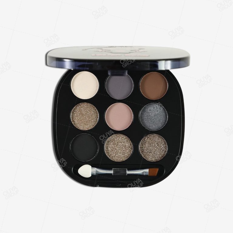
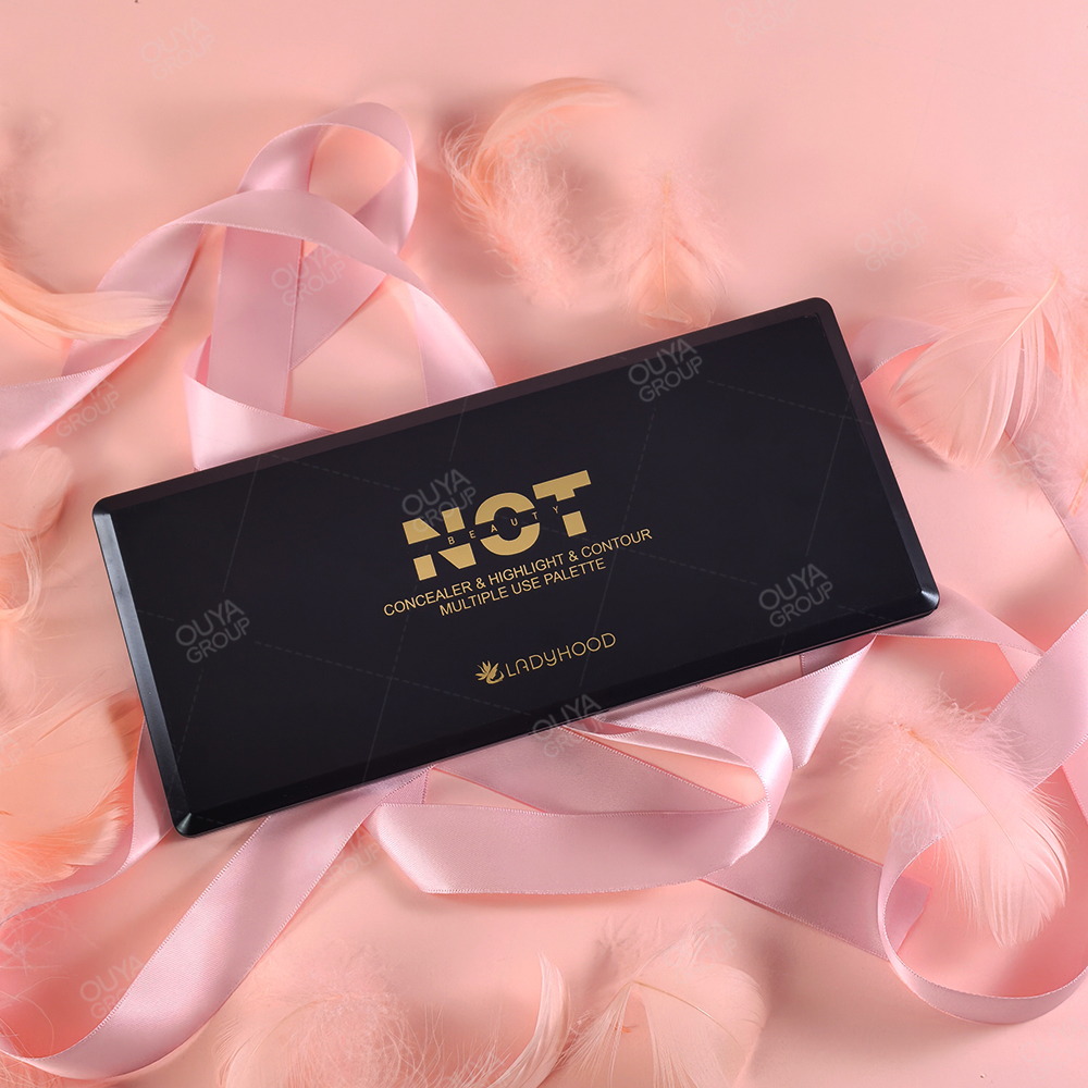
أويا بيوتيتتميز تركيبة باليت تحديد الوجه FB0001-A04 من علامة "كونتورينغ" بقوام كريمي سهل الدمج، مع ترطيب مثالي، وتأتي في عبوة عملية سهلة الحمل. تُعدّ هذه التفاصيل الخاصة بالمنتج نقطة مقارنة مفيدة لمفهوم تحديد الوجه الكريمي، لكنها لا تُثبت فعاليته في التحكم بالزيوت. لا يزال هذا المنتج مناسبًا للبشرة الدهنية، ويحتاج إلى تقييم خاص من حيث ثباته ومقاومته للإفرازات الدهنية.
اتباع تسلسل استخدام واضح يمنع الشعور بالتعقيد عند استخدام لوحة الألوان: خذي كمية صغيرة، ضعي الظل بجانب ملامح الوجه، امزجي الحافة مع اللون الأساسي، ثم أضيفي اللون فقط حيث يحتاج شكل الوجه إلى مزيد من التحديد. هذا التسلسل أكثر فائدة من نصح المتسوقات باستخدام كل لون في إطلالة واحدة.
- حدد قاعدة الجرعة الخفيفة أولاً لوضعها على الأنف والخدين والفك.
- تحققي من النتيجة النهائية بعد وضع طبقات من كريم الأساس والبودرة وزيت الوجه الطبيعي.
- اكتب خريطة الظلال حتى يتمكن التجار من شرح الأدوار المحايدة والمتعمقة والمتوازنة.
للحصول على حل عملي باليت كونتور كريمي باختصار، قم بربط بنية لوحة الألوان بالأداة واللمسة النهائية ونطاق لون البشرة المقصود قبل العمل الفني النهائي.
اجعل اختبار التحمل يعكس وعد الرف
السؤال الأساسي حول ثبات المنتج هو ما إذا كان الكونتور يبقى ظلاً ناعماً بعد يوم عادي. سجّلي عملية المزج الأولى، والمظهر بعد اللمعان، ومدى انتقاله إلى طبقة الأساس المجاورة، وسهولة إجراء تعديلات بسيطة. قد لا تفي تركيبة المنتج التي لا تدوم إلا عند وضع كمية كبيرة من البودرة بوعد الحصول على مظهر طبيعي يشبه البشرة.
ينبغي أن تصف الادعاءات الأداء المُختبَر، لا التطلعات. تجنب القول بأن كريم تحديد الوجه مقاوم للتعرق بشكل عام، أو غير قابل للانتقال، أو مناسب لجميع أنواع البشرة الدهنية، إلا إذا كانت نتائج الاختبارات ولغة التسويق تدعم هذه الادعاءات. غالبًا ما يمنح التحديد الواضح للقيود بائع التجزئة ثقة أكبر من الادعاء المطلق.
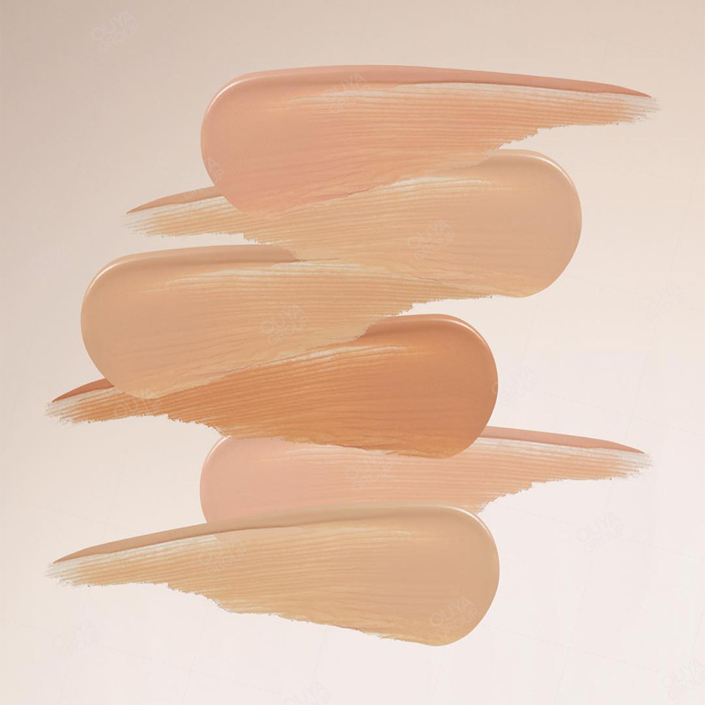
يجب أن تُظهر العروض المرئية لوحة الألوان على أكثر من درجة لون بشرة، وأن توضح الفرق بين الألوان الدافئة والمحايدة. هذا يُساعد المتسوقين على اختيار الدرجة المناسبة بسهولة أكبر، ويُعطي فريق المبيعات إجابة واضحة عند سؤال أحدهم عن سبب اختلاف مظهر الكونتور عن البرونزر. كما يُعطي فرق المحتوى سببًا لاستخدام صور مقربة لتطبيق المنتج بدلًا من الاعتماد على عينة اللون التي لا تُظهر الظل النهائي.
عندما تحتاج العلامة التجارية إلى تنسيق بين تركيبة المنتج والتغليف واللون، طريقة استخدام لوحة تحديد الوجه يمكن ربط المحتوى بملاحظات توضيحية تحافظ على توافق التعليم النهائي مع المنتج النهائي.
استنتاج
تنجح لوحة تحديد ملامح الوجه الكريمية للبشرة الدهنية والمختلطة عندما تبقى سهلة الدمج، وتحافظ على لون محايد متناسق، وتبقى واضحة حتى بعد اللمعان. حددي اللون المطلوب، واختبري الكمية المناسبة وسلوك المكونات، وتأكدي من ثباتها تحت طبقات متعددة. الخطوة التالية هي اختيار ثلاثة أو أربعة ألوان وطريقة تطبيقها التي تجعل تحقيق النتائج المرجوة أسهل ما يكون.
للحصول على ملخص عن اللون والاستخدام، الاتصال أويا بيوتي مع نطاق ألوان البشرة المستهدفة، واللمسة النهائية، وحجم العبوة، وأداة التطبيق، والأسواق.
أسئلة متكررة
لماذا يبدو الكونتور الكريمي باهتاً؟
قد ينتج عدم تجانس اللون عن استخدام لون دافئ، أو كمية زائدة من المنتج، أو قاعدة غير مناسبة، أو تحرك المنتج بعد اللمعان. يبدأ الحل بتحديد درجة اللون وكميته، وليس فقط باستخدام صبغة أقوى. كما قد ينتج عدم تجانس في تحديد الوجه عند استخدام لون برونزي دافئ في مكان يحتاج إلى ظل محايد، لذا قارن احتمالية عدم تجانس تحديد الوجه تحت إضاءة المتجر.
هل يجب أن يكون لون الكونتور أغمق من لون كريم الأساس؟
ينبغي أن يُشكّل ظلاً واضحاً دون أن يبدو كخط منفصل. يعتمد عمق الظل على لون البشرة والإضاءة والشكل المطلوب، لذا فإن إمكانية تكثيف الظل أكثر فائدة من قاعدة ثابتة للظل الداكن.
هل كريم تحديد ملامح الوجه مناسب للبشرة الدهنية؟
يمكن ذلك، شريطة أن تتوازن التركيبة بين الانزلاق والثبات، وأن يتم اختبارها على القاعدة المقصودة وروتين الضبط. تتطلب ادعاءات التحكم في الزيت أدلة خاصة بالمنتج.
كم عدد الألوان التي يجب أن تحتوي عليها لوحة الألوان؟
استخدمي أصغر مجموعة ألوان تغطي نطاق لون البشرة المطلوب ولها استخدامات محددة. أما الألوان الإضافية، فيجب أن يكون لها استخدام واضح أو حاجة إلى لون البشرة الأساسي.
كيف ينبغي لتجار التجزئة شرح الفرق بين الكونتور والبرونزر؟
اشرحي الكونتور بأنه ظل مُحدد الشكل، والبرونزر بأنه لون دافئ. يجب أن تتطابق الصياغة النهائية مع درجات الألوان واللمسات النهائية في لوحة الألوان المعتمدة.