A beauty product has to win twice: first on the screen, then in the hand. In 2026, shoppers notice color, cap shape, surface finish, and how a product looks in a short video before they read a full product name. This is why cosmetic packaging lines need one family feeling.
Family packaging design gives a cosmetic brand a visual system. A lip glaze, blush, mascara, cream, and fragrance may serve different routines, but they should still feel related. The buyer should sense the same brand mood at first glance: soft, playful, clinical, or premium. For private label packaging, that consistency can turn a basic product group into a retail-ready collection.
Why Family Design Matters in Cosmetic Packaging Lines
Packaging is not only a shell. It is the first brand cue before texture, scent, shade, or wear time can prove anything. When cosmetic packaging lines use different colors, fonts, bottle shapes, and label rules without a system, the shelf becomes noisy. Each SKU may look fine alone, but the full collection loses power.
Strong family packaging design answers three quick questions:
- What brand is this?
- Which products belong together?
- What quality level should I expect?
This is especially important for custom cosmetic packaging because many brands build shade ranges, seasonal drops, lip-and-cheek sets, and retail bundles. A cosmetic packaging factory that understands family design makes more than containers. It helps build a product language that can grow. The formula may change from gloss to tint, but the visual memory should stay.
The Core Logic Behind Family Packaging Design
A good family system is not about making every product look identical. If all items look the same, customers may struggle to tell them apart. If every item looks unrelated, the brand loses recall. The real task is to keep brand memory steady while letting each product explain its own function.
Fixed Elements: What Should Stay the Same
Fixed elements create brand recognition. They should remain stable across the cosmetic packaging lines, even when the product category changes.
Common fixed elements include logo placement, main typography, cap proportion, label structure, signature color accents, surface finish, and repeated structural details such as a curved tube or diamond-cut edge. These elements work like a visual signature and build a cleaner shelf story.
Flexible Elements: What Can Change by Product
Flexible elements help each product speak clearly. A moisturizer should not feel exactly like a lip stain. A bright blush collection may need more energy than a calming skincare item. Flexible design keeps the product easy to read while staying inside the family system.
Flexible elements may include shade name blocks, category color bands, seasonal illustrations, special finishes, cap color changes, or transparent windows for formula visibility. This is where custom cosmetic packaging becomes powerful. Brands can change details without breaking the full identity. If the bottle shape, logo position, and label rhythm stay close, the family still feels complete.
How Packaging Design Consistency Builds Buyer Trust
Consumers may not use the words “packaging design consistency,” but they feel it. When a product line looks steady and well planned, buyers often read it as more professional. In beauty, that matters because the product touches the skin, lips, eyes, or hair. A playful brand can still be consistent. A bold color brand can still use clear rules. The point is control. Customers should feel that every design choice is intentional. For product teams, the same control also saves time: briefs become clearer, sampling runs smoother, and future SKUs do not start from zero.
Building a Family System for Custom Cosmetic Packaging
Family design works best when it starts before the first production order. Many brands make the mistake of choosing one beautiful container, then trying to force future products to follow it. A smarter route is to map the whole product world first, even if only one item will launch first.
Step 1: Define the Brand Mood in Plain Words
A design team should be able to describe the brand mood in three to five words:
- Clean, soft, dermatologist-inspired
- Sweet, shiny, youth-focused
- Premium, sculptural, fashion-led
- Natural, warm, ingredient-conscious
- Bold, colorful, performance-driven
These words guide every design choice. A premium sculptural line may choose thicker walls, heavier caps, and subtle color. A playful lip line may use clear bodies, brighter shades, and rounded shapes. Without mood words, family packaging design becomes personal taste instead of brand strategy.
Step 2: Choose One Main Visual Anchor
Every family needs an anchor. It may be a bottle silhouette, a cap style, a logo panel, a color block, or a special texture. This anchor should appear often enough to be remembered.
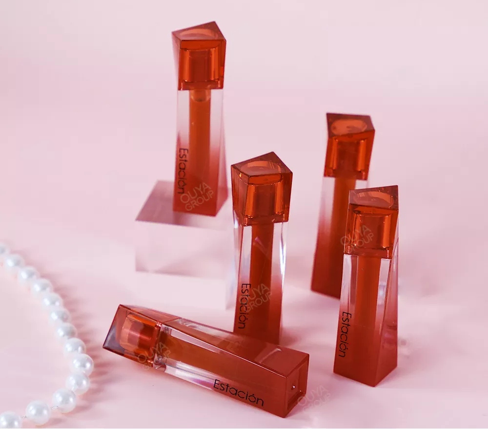
OUYA’s Water Lip Glaze In Beautiful Skirt Shape gives a clear example for lip products. Its skirt-like tube shape, gradient color effect, visible body, and 3.8 ml fill make the item easy to recognize. For a brand building cosmetic packaging lines around lip glaze, lip oil, or lip tint, a similar shape language can become the start of a family system.
Step 3: Plan Shade and Category Rules
Color is one of the fastest ways to separate products. But too much color without rules can weaken the brand. A better system gives each shade or category a defined role.
For example:
- Same bottle, different shade windows
- Same cap, different label color by product type
- Same logo area, different accent tone
- Same outer carton layout, different front image
These rules are useful for private label packaging because buyers may need several product ranges under one retail name. Clear color logic helps shoppers find the right item faster.
What a Cosmetic Packaging Factory Should Support
Family design cannot stay on a mood board. It has to survive tooling, filling, printing, assembly, packing, and shipment. That is why the factory role matters. A beautiful bottle is not enough if the cap color shifts from batch to batch, the logo rubs off, or the label cannot align well during mass production.
A qualified cosmetic packaging factory should support:
- Custom color matching for packaging and formula
- Printing and decoration control
- Sample testing before full production
- Tooling support for custom shapes
- Compatibility checks between formula and container
- QC checkpoints for appearance and function
- Regulatory file and export support
OUYA works in the OEM/ODM beauty field, covering custom formulation, sample development, package tooling, mass production, quality control, regulatory support, and global shipping. For brands developing custom cosmetic packaging, that full-process model is useful because formula, packaging, and compliance can be discussed together.
The company’s manufacturing background also fits private label packaging. Long beauty production experience, automated production lines, clean-room support, and quality systems help reduce scale-up risk. For lip and cheek products, where color, texture, filling accuracy, and safety checks are highly visible, factory discipline has real commercial value.
Common Mistakes in Family Packaging Design
Even strong beauty brands can weaken their packaging family by making small decisions too quickly. The common mistakes are easy to miss: too many fonts, shifting logo positions, trend-led colors with no long-term system, SKUs that look loud but not connected, and private label packaging treated as decoration rather than brand identity. Overdesign is another risk. Metallic finish, gradient color, embossing, windows, and a special cap can all be useful. But if every feature fights for attention, the customer sees noise.
How to Brief a Factory for Better Packaging Design Consistency
A good brief saves time. Instead of sending only a reference picture, brands should give the cosmetic packaging factory a clear design and business context.
A useful brief may include target market, price level, retail channel, planned product categories, brand mood words, logo rules, color rules, preferred materials, formula type, filling volume, MOQ, sample timeline, and launch deadline. This keeps packaging design consistency from becoming vague. For brands working with OUYA, the OEM/ODM route can connect these choices with formula development, sampling, and packaging selection.
Conclusion
Family design is not a surface trend. It is a practical way to make cosmetic packaging lines easier to recognize, easier to extend, and easier to trust. Strong family packaging design gives each product its own role while keeping the full brand world connected. For custom cosmetic packaging and private label packaging, this matters even more because buyers often build several SKUs at once. OUYA’s factory strength, OEM/ODM experience, automated production support, clean-room conditions, and quality control process make it a relevant partner for brands that want beauty packaging with both identity and production discipline. For brands planning new lip, face, or makeup collections, contacting us can be a useful step before the design system becomes too fixed.
FAQs
Q: What is family packaging design in beauty products?
A: It is a shared visual system across related cosmetic packaging lines.
Q: Why does private label packaging need consistency?
A: Consistency helps products look professional, connected, and easier to trust.
Q: Can OUYA support custom cosmetic packaging projects?
A: Yes. OUYA supports formulation, packaging, sampling, production, and export needs.