A contour sample often looks great in the pot. However, it can leave a dull mark when you blend it onto the face. Putting on extra product just makes that mark bigger. A brand creating a cream sculpting item needs to fix this exact issue. The goal is making a realistic shadow with a smooth border. At the same time, the natural skin must stay visible. The makeup underneath must also remain perfectly safe.
A shadow needs an edge that disappears
The question “why does my contour look muddy” shows a final result instead of one simple flaw. A specific color might be too harsh for the skin tone. It could also be too warm for a proper shadow. Sometimes, users simply spread it across a huge space. Many different mistakes cause this same flat, brown spot.
Natural-looking shape relies on the actual color. It also depends on how that color fades into the nearby skin. A small spot of darkness with a soft border gives a great effect. This looks totally different from the exact same pigment rubbed widely over the cheek. Therefore, the blended finish is highly important. It helps much more than a thick swatch during product planning.
Texture is very important. Blending must smooth out the edge without removing the foundation below it. When comparing cream contour cream contour palette. observe how smoothly the pigment glides, whether it stays in the intended application area, and how much blending the underlying foundation can withstand.You should test the color darkness and the base tone separately on the target skin types.
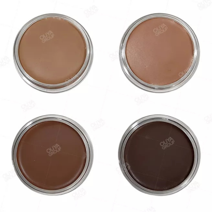
Fig 1: Contour cream (FB0001-A04)
Three different problems hide inside a muddy result
Looking at color, location, and texture separately makes feedback much clearer. A basic note like “too dirty” just leaves the creator confused. You should explain exactly when and where the bad effect happens. This detail gives the next version a firm direction.
Too much depth in the first touch
A thick initial layer leaves very little space to add more later. This problem stands out clearly when you test a dark color on pale skin. That skin might only need a tiny bit of shaping. You must ask a vital question. Does the mixture form a realistic shadow using a tiny drop? It should also allow users to build bolder lines if they wish.
An undertone that reads as a colored stripe
The base tone must match the skin and the planned shadow perfectly. A highly warm finish might look like fake sun tan instead of real bone structure. On the other hand, a highly gray finish can seem lifeless. People often say you should always pick the coldest brown available. However, that common rule does not actually fix this balance issue.
Blending that spreads or lifts the base
The question “why does my contour look patchy” highlights spreading issues along with color faults. A product might stick to the skin instantly. This fast grip can leave a harsh border. Meanwhile, constant rubbing could ruin the foundation below. You need to view these texture problems independently. Do not confuse them with a smoothly blended color that just looks awful.
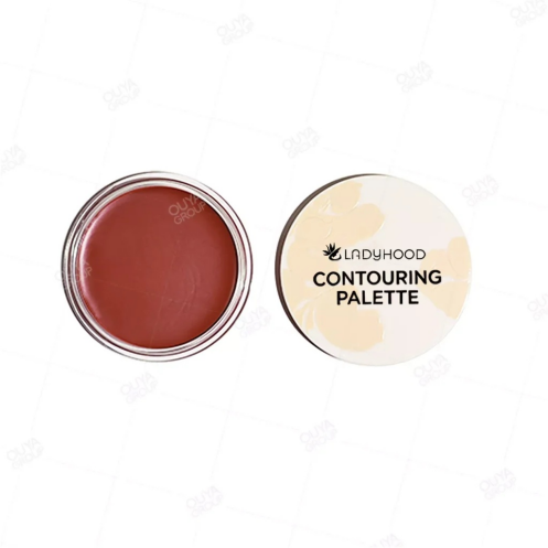
Fig 2: Contour cream (FB0001-A04)
The useful comparison happens at the blended edge
A direct comparison works best when both test items show similar starting darkness. You might put a thick line of one item and a small speck of the second. This poor method makes texture testing very hard. You need to use an equal amount for both. You also need to apply the exact same base makeup. This strict method keeps your attention on the true differences.
|
Visible result |
Likely question to investigate |
Useful comparison |
|---|---|---|
|
Dark line showing a harsh border |
Is the initial layer too heavy? |
Test a lighter amount in the exact spot |
|
Smooth yet orange-toned section |
Does the base tone fit the desired shadow? |
Check a cooler option using similar darkness |
|
Lifeless gray look following the blend |
Is the color too dull for the face? |
Test a completely different base tone |
|
Empty spots showing beneath the makeup |
Is the rubbing action destroying the foundation? |
Evaluate the formula feel and the rubbing force |
These are practical questions for the lab. They are not quick guesses from a picture. A helpful test alters just one single factor. It keeps all other details completely steady. Less product might fix the harsh border. Yet, it could still leave a bad color tone. In this case, the pigment still requires work. The spreading quality improved, but the color failed.
Teams often build custom formula cosmetics. For these groups, separating problems makes feedback much simpler to use. “Softer border with equal darkness” demands a specific change. This differs greatly from “less warmth with equal smoothness.” Both of these clear requests are highly useful. They work better than asking for a basic overall upgrade.
A Talc-free formula choice appears in the future blush and pressed powder line from OUYA BEAUTY. These items must join a full makeup test. You should apply the final powder over the cream shape using a steady amount. Does the border remain smooth? Does the color stay bright? Does this new layer ruin the foundation? The chemical plan alone cannot prove how nicely these two items mix.
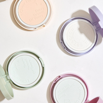
Fig 3: Dual Protective Pressed Powder (FP02454501)
A shade range built around believable definition
People frequently hunt for the best contour palette for medium skin. This search highlights a massive matching struggle. A color pan might look highly flexible in the box. However, it could turn out too light, intensely bright, or overly dark after rubbing. Medium skin features several different base tones. Because of this, simple darkness labels only give a partial solution.
A smart color check focuses on the target buyers. It should not focus on the total pan count. You must test every planned color on real skin types. Then, write down the exact job it does. A soft daily shadow serves one goal. A dark shaping choice serves another. They require clear, distinct jobs to stay in the final collection.
Three basic phrases help a group talk about this goal:
· A light touch builds realistic shaping on the target skin.
· The border fades out smoothly. It avoids pushing pigment over the entire face.
· Extra layers stay neat. They avoid becoming a solid, ugly spot.
The store display must show this exact same target. Guides showing how to handle cream contour palette items are highly valuable. They work best when they highlight the tiny drop needed. They should also show the small zone required for success. A massive line might create an exciting internet video. Still, it gives a terrible lesson for a soft, natural look.
A softer edge gives the product a clearer purpose
Flawless cream shaping relies on a strong link between color, amount, and smoothness. The finest test item builds the right darkness using a fair drop. After that, it melts neatly into the nearby skin. You must fix ugly warmth, thick chunks, and foundation damage independently. By doing this, the following factory version gains a sharp focus.
You might need support building a cream shaping line. We can help create balanced colors and a gentle fading border. Please contact us for assistance.
FAQ
Why does a darker shade sometimes look muddy?
A color might be overly intense for the chosen drop size. This mistake forms a solid spot rather than gentle darkness. You should test a tiny amount first. Do this before changing the actual pigment formula.
Is the coolest brown always the best sculpting shade?
No, it is not. The right base tone relies on the user’s skin and the planned look. Too much gray causes a terrible match as well. You must check the rubbed finish on the actual target buyers. Do not judge the plain box by itself.
Does easier blending automatically mean better definition?
Not at all. The mixture needs firm control. This control keeps the pigment inside the correct zone. Huge spreading can destroy the shadow’s true shape. This failure happens even if the border feels incredibly easy to rub.
What separates a shade issue from a texture issue?
A smoothly rubbed yet ugly tone highlights a color fault. A harsh border, chunky spots, or damaged bottom makeup show texture flaws. They could also mean poor rubbing technique. You must study these details separately.
Does a larger palette solve shade matching?
It only works if the bonus colors perform clear, helpful jobs. A tiny, smart collection is often easier to sell. It beats having multiple twin browns. These nearidentical brown shades still fail to fill actual undertone gaps for target skin groups.